BBC Reveal Beta of their new Homepage
The BBC have made available to the public the beta of their new homepage which is likely to be a close to finished product unless there are any major problems through testing it or if it is disliked by the public.
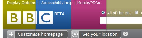
I think it looks OK, except for the text for the headings on the individual content boxes. The text and box header is too big and looks stupid in my opinion.
Unfortunately making the text smaller through the browser does make the rest of the text on the site unreadable so unless the BBC change it, you can't really do a lot without scriptmonkey or the edit css addons for Firefox.
I think it is a good use of AJAX, allowing the user pretty much full control over the layout and look of the page itself. My only gripe is the colours they have used.
The only one of those colours that really suits the BBC would be the blue. The pink and yellowy green just look completely out of place. A simple RGB and a good yellow would be sufficient for a good look site.
Also another problem is that there are no previews as to what the rest of the site will look like. I guess you could look at the blogs and get a general idea of what the BBC are aiming for in the site.
You can follow this link to view the BBC Beta Homepage.