Create a basic layout using HTML & CSS
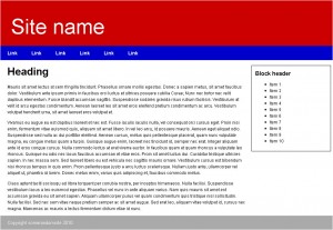
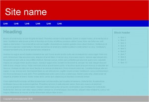
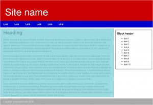
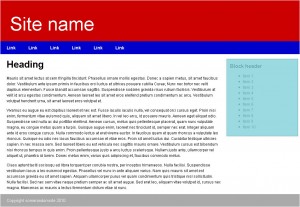
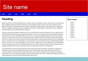
Following on from the Guide to classes and ids in HTML and CSS, we will create this basic 2 column layout.
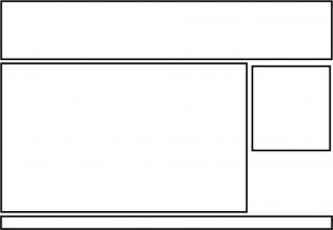
Before we delve in to HTML and CSS, you need to understand the basic structure of the page to know how to write your HTML. To do this, on paper or Photoshop draw out the basic layout.
With the basic wireframe of the site you can now write out the basic HTML.
<?php<!DOCTYPE html PUBLIC "-//W3C//DTD XHTML 1.0 Strict//EN" "http://www.w3.org/TR/xhtml1/DTD/xhtml1-strict.dtd">
<html xmlns="http://www.w3.org/1999/xhtml">
<head>
  <meta http-equiv="Content-Type" content="text/html; charset=utf-8" />
  <title>2 Column Layout</title>
</head>
<body>
  <div id="wrap">
    <div id="header">
        <h1>Site name</h1>
    </div>
    <div id="navigation">
      <ul>
          <li><a href="#">Link</a></li>
        <li><a href="#">Link</a></li>
        <li><a href="#">Link</a></li>
        <li><a href="#">Link</a></li>
        <li><a href="#">Link</a></li>
        <li><a href="#">Link</a></li>
      </ul>
    </div>
    <div id="content_area">
      <div id="content">
        <h2>Heading</h2>
        <p>Mauris sit amet lectus at sem fringilla tincidunt. Phasellus ornare mollis egestas. Donec a sapien metus, sit amet faucibus dolor. Vestibulum ante ipsum primis in faucibus orci luctus et ultrices posuere cubilia Curae; Nunc nec tortor nec velit dapibus elementum. Fusce blandit accumsan sagittis. Suspendisse sodales gravida risus rutrum facilisis. Vestibulum at velit id arcu egestas condimentum. Aenean laoreet leo sit amet eros eleifend pretium condimentum ac arcu. Vestibulum volutpat hendrerit urna, sit amet laoreet eros volutpat et.</p>
      </div>
      <div id="sidebar">
        <div class="block">
          <h3>Block header</h3>
          <ul>
            <li>Item 1</li>
            <li>Item 2</li>
            <li>Item 3</li>
            <li>Item 4</li>
            <li>Item 5</li>
            <li>Item 6</li>
            <li>Item 7</li>
            <li>Item 8</li>
            <li>Item 9</li>
            <li>Item 10</li>
          </ul>
        </div>
      </div>
    </div>
    <div id="footer">
        <p>Copyright somerandomsite 2010</p>
    </div>
  </div>
</body>
</html>?>
This gives the bare markup needed for the layout.
For the CSS we will go through each separate HTML element.
Wrapper
We start the document off with a div with an id of wrap. This gives us a container that we can set a width to as we can't set a width to the body tag.
<?php#wrap {
  width: 980px;
  margin: 0 auto;
}?>
This sets the width of the container to 980px. Setting the margin to 0 auto means that the top and bottom margins are set to 0 and the left and right margins are set to automatically generate. The browser will then set the left and right margins to be the same which results in the container being centered in the body.
Header
For the header, we will need to style the header div itself as well as the h1 tag inside it.
<?php#header { background: #c00; }
#header h1 {
  color: #fff;
  margin: 0;
  padding: 30px 10px 10px 30px;
  font-size: 6em;
  font-weight: normal;
}?>
With this CSS we are making the background color of the div with id header to #c00 which is a dark red. As divs are block level elements it will automatically fill the width of it's parent which is our div with the id wrap. So we have a div with a red background which is 980px wide.
Within our header div we have an h1 tag. For this we change it to white by using color: #fff. We then remove any margins on the h1 tag which are applied automatically by the browser then set some padding around the text so that it doesn't touch the edge of the div. To make it stand out we make the font-size 6x bigger than the standard font-size of the page which you can specify in the body CSS, and make the font-weight normal rather than bold.
Navigation bar
The navigation bar is made from an unordered list which allows internet robots (search engines) and screen readers (browsers for blind/hard of sight users) to navigate the site properly. You could make it using a p tag with spaces between the links but that wouldn't be good for accessibility or SEO.
<?php#navigation ul {
  margin: 0;
  padding: 0;
  list-style: none;
  float: left;
  background: #00c;
  width: 100%;
}
#navigation ul li {
  float: left;
  width: auto;
}
#navigation ul li a {
  display: block;
  padding: 10px 20px;
  color: #fff;
  text-decoration: none;
  font-size: 1.4em;
  font-weight: bold;
}
#navigation ul li a:hover {
  color: #00c;
  background: #fff;
}?>
The first thing we do is to reset the default styling given to unordered lists (the bullet points etc) by resetting the margin, padding and list-style (bullet points). Then we float the whole list to the left so that the ul element takes the height of the children list elements. We also set the background colour and set the width to 100% so that it takes the whole width of the container, otherwise the background colour would stop after the last list element.
Each list element within the unordered list is floated to the left so they all line up next to each other. We also define the width as auto, if you don't do this the CSS validator will mark your code as invalid CSS.
Each anchor tag with in the list is giving some padding to give space to each link. We have to define the display of each anchor tag as block so that we can apply vertical padding to each link, this also allows better hover styling as the cursor doesn't have to be on the text and can be anywhere within the padded area. As well as the padding the colour is changed to make the text contrast the background and we remove the default text-decoration of anchor tags which is the underline by setting it to none. I also made the font slightly bigger and bold.
As well as the default state of the anchor tags, we can also define the hover attribute using a pseudo class called :hover. When the user hovers their mouse over the HTML element defined by the selector the browser will pick up on these CSS changes and will be reverted as soon as the mouse stops hovering over the element. Here we are just changing the colour and background so that the user can see that it has a click-able action.
Content area
Our content area div is a minor container div to enclose the main content and sidebar. You don't have to use this, but it makes it a lot easier to style and line up elements in all the browsers.
<?php#content_area {
  clear: both;
  padding-top: 10px;
}?>
The clear attribute makes sure that any floating elements are cleared, so essentially the div will appear on the next free line below any floating elements and allows us to put some padding between the navigation and our content. With out the clear attribute, the padding would have no effect.
Content
<?php#content {
  float: left;
  width: 75%;
}
#content h2, #content p {
  padding: 0 10px 0 20px;
}
#content h2 {
  font-size: 3.0em;
  margin: 0;
}
#content p {
  font-size: 1.2em;
}?>
The first thing we do is set the width of our content div and float it to the left, this allows the sidebar to go along side it.
We also apply some standard CSS rules to add padding and change the font size of elements within the content div.
Sidebar
<?php#sidebar {
  margin-left: 75%;
}
#sidebar h3 {
  font-size: 1.6em;
  margin: 0;
}
#sidebar li {
  font-size: 1.2em;
}
.block {
  border: 1px solid #000;
  padding: 10px;
  margin: 5px;
}?>
To get the sidebar to move up to the right of the content we need to make sure that it isn't trying to display on top or behind it. To do this, we apply a left margin to the sidebar, the left margin should be the same or bigger (if you want to include a space between your sidebar and content) than your content width. You can also do this by setting the width and floating it to the left or right, but this can cause complications especially when you have more than 2 columns.
As with the content we apply some basic styling to the elements within the sidebar.
Footer
<?php#footer {
  clear: both;
  background: #aaa;
}
#footer p {
  padding: 10px 20px;
  color: #fff;
  font-size: 1.3em;
}?>
Much like the content area we need to clear any floating elements above it. I have also change the background colour to a light grey.
